GitHub Education Verification System
Design Lead. UI/UX design. Design direction.
Project background
The GitHub Education honor roll system offers a secure method for managing the account details of students and teachers. This system enables users globally to submit dated evidence of their status, regardless of whether they have an email address or student ID. Recognizing the complexity of the existing system, the Honor Roll team is now focused on enhancing the user experience and updating the user interface to be consistent with GitHub's design standards.
Project details
-
GitHub Classroom assignment overview page is lacking the capability for holding the large scope of students classroom.
Teachers always get confused by the current UI/UX flow. With the nonfunctional interface, users can not get the work done efficiently.
There is only one entrance to get to the Classroom.
GitHub Classroom needs design branding love.
-
The goal is to make the product more engaging with GitHub users, increase the visibility, and fit a larger user scope by optimizing the user experience and user interface.
-
Design lead, Decision maker. Deliver the designs. Collaborated with PM, engineers, and user researchers.
-
Design: 4 weeks
Total project: 1 month
User Research / Interview
The objective of the interview is to find out the pain point of users when they interact with the product. I conducted the user interview with the PM. We conducted several focus groups and one on one interviews. We listed the questions and narrowed down the user feedback.
Define problem

-

Discoverability of GitHub Classroom
It ‘s been a problem for most of first-time users to get the access to GitHub Classroom. There is only one way to get to the homepage after signing up, or users have to search GitHub Classroom in Google to find it.
-

Unclear UI
The current UI is complicated. The hierarchy of the information is not clear. Users have to figure out by themselves. The on/off indicator of the invitation link is confusing.
-

Redundant design
The functional links on the page is redundant. it not as simple as it is supposed to be. The dropdown filter is not clear enough to help the users.
Optimize the user flow

Design iterations


UI improvement
-

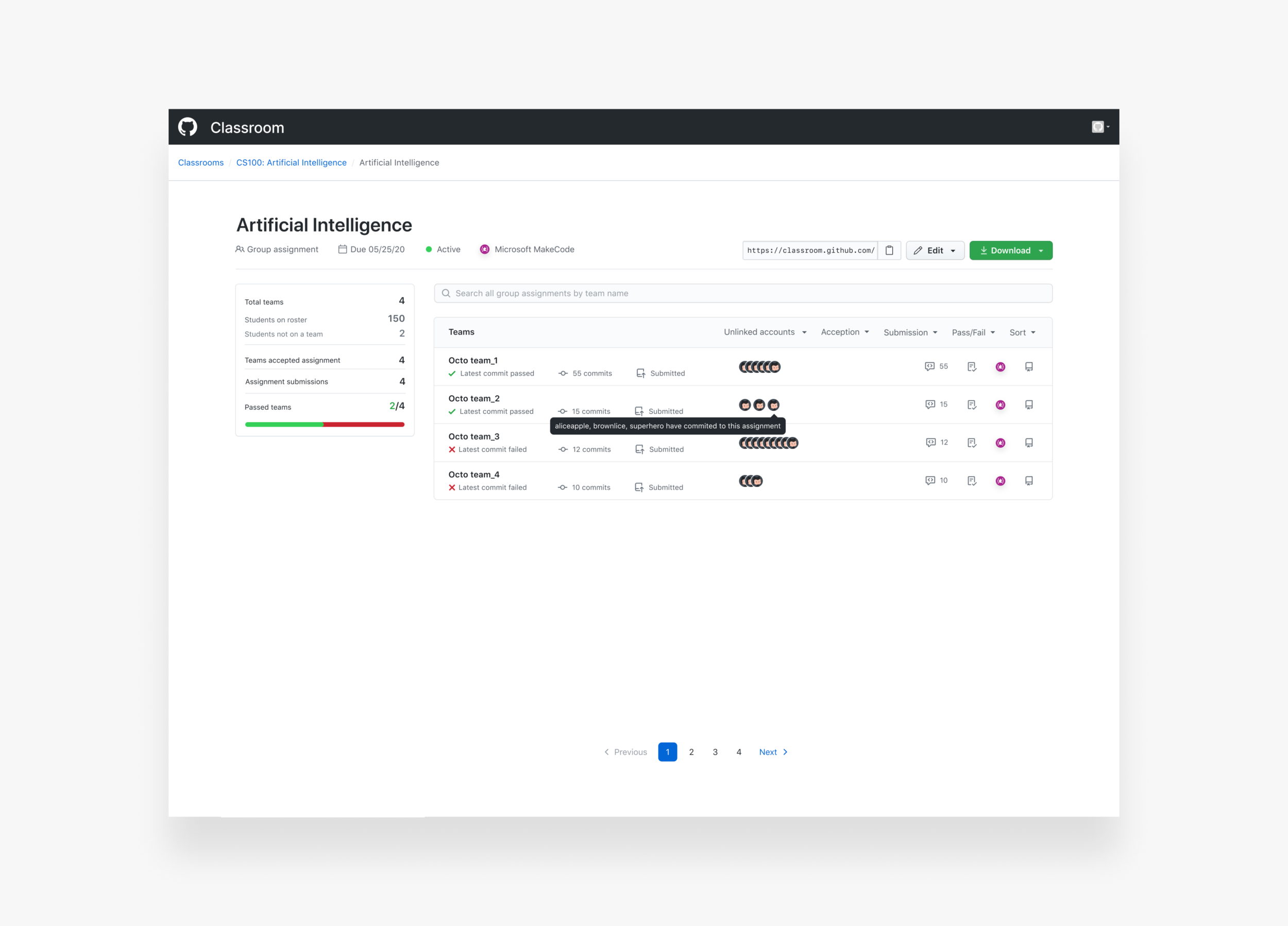
Navigation improvement
Compares to the current navigation, the new design clearly shows the data of the class, which includes the assignment type, due date, assignment status, and the IDE. The action buttons are listed in the same row on the right.
-

Filter and Search
The function of filter and search becomes more visible in the new design. Users can filter the items by categories. Each category has more than one options. The 2.0 version is to make the side data linkable.
-

Action buttons
The new design has the icons instead of repeated texts. The idea is to have the same icons used in the product that users are familiar with as the action buttons in the row. So users know what it means and where the link will take them to.
-

Edit view improvement
In the new design, I moved the delete button to the edit view instead of the dropdown on the top layer. The reason why I am doing it because the the frequency of the delete button usage. Beyond that, I worked with PM to have the assignment status (active/inactive) in the edit view.
Final designs


Outcomes
Coming soon…